AI did not end the data literacy crisis. It changed it. As machines move from providing information to interpreting it and recommending what to do, the scarce skill is becoming judgment: knowing what to trust, what to question, and what decisions are still ours to make.
Evidence does not make decisions. People interpret it, weigh it, challenge it, and make judgments. A courtroom reveals what leaders can learn about evidence, expertise, confidence, and data-informed decision-making.
Feeling sure doesn't mean you're right. Learn five simple ways to question what feels true, spot what might be influencing you, and make better decisions about what to believe.
How Misleading Data Visualizations Spread Faster Than the Truth
That pretty chart you just shared? You became a misinformation spreader. Social media turned data pros into accidental propagandists. 80% misread "creative" charts while simple ones reveal truth instantly. Choose clarity over clicks.
Design isn't neutral. It either reveals truth or distorts it.
The Bottom Line Upfront
We're not in a data visualization crisis, we're in an Information Apocalypse, and pretty charts are the horsemen.
The Problem: Data professionals think they're making charts. They're actually manufacturing propaganda
The Reality: Every decorative element you add is a choice to make the world more confusing
The Solution: Stop treating data visualization as graphic design. Start treating it as life-or-death communication
What You're Getting Wrong Social media didn't break data visualization, it revealed that we never understood what visualization was for.
Wrong Question: "How can we make this chart more engaging?"
Right Question: "What does my audience need to understand in 3 seconds?"
The Shift: From optimizing for likes to optimizing for lives saved, decisions made, and democracy preserved
The Surprising Truth The most dangerous myth in data visualization? That effective design is boring. The truth is that clarity is beauty.
Misinformation spreads 6x faster than truth, and your Instagram-worthy charts are the delivery system
80% of viewers misread truncated bar charts, but we keep making them because they "look better."
40% reduction in medical errors happened when one hospital chose "boring" dashboards over award-winning designs
What the Experts Won't Tell You Stop asking 'Will this get shared?' Start asking 'Will this save lives?'
Old Mindset: Aesthetic-first thinking prioritizes viral potential over verified truth
New Reality: Teams using clear visuals cut meeting time by 24% and make better decisions faster
The Truth: Every share of a misleading chart makes you complicit in the systematic destruction of informed decision-making
The Bottom Line You're not a chart maker. You're a truth-teller in an age where beautiful lies spread faster than boring facts. Every visualization you publish either builds or erodes trust in data itself. The choice is binary. Feed the misinformation machine or join the resistance.
How Sharing One Pretty Chart Made You a Misinformation Spreader
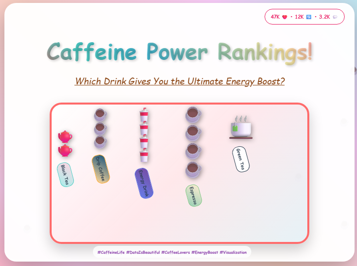
Imagine you're scrolling through LinkedIn while waiting for your morning coffee, and a colorful chart catches your eye. It's got artistic cup icons stacked in creative ways, a rainbow of colors, and floating coffee beans for flair. The title promises to reveal "caffeine ratings" across different beverages. You like it, share it, maybe even bookmark it for later.
Congratulations. You just became a misinformation spreader.
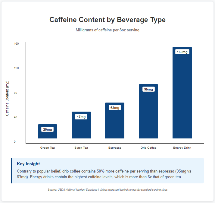
That eye-catching, Instagram-worthy visualization completely misrepresents the data. The spacing between values is wildly inconsistent, the icons suggest equal intervals when the actual numbers jump from 25mg to 95mg with the same visual gap, and most people walk away thinking espresso has more caffeine than regular coffee (it doesn't, per serving).
Meanwhile, a simple bar chart with the same data, which some may say is boring-looking by social media standards would have given you accurate insights in three seconds flat.
But you chose the lie. And 47,000 other people shared it too.
The High Cost of Misleading Visuals
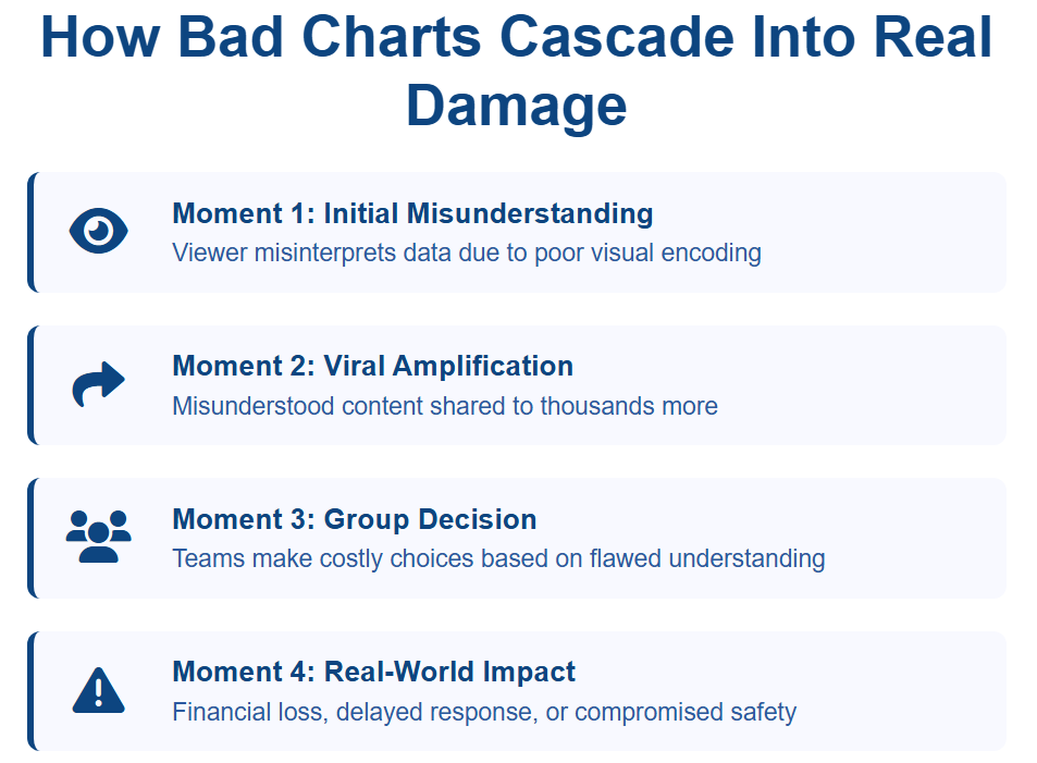
While you're chuckling at that cute coffee chart, the same design-first thinking is actively poisoning business decisions, public health responses, and democratic discourse. This isn’t about “creative differences” in chart design. It’s about the systematic destruction of our collective ability to understand reality.
We're living through an Information Apocalypse. Pretty charts are the horsemen.
When COVID case tracking visuals prioritize aesthetic appeal over chronological accuracy, they don’t just “look misleading.” They can influence behavior during a health crisis and potentially cost lives. When corporate dashboards elevate creativity above clarity, they don’t just slow decisions. They destroy billions in shareholder value. When election data gets the Instagram treatment, it doesn’t just confuse voters. It undermines democracy itself.
On social platforms and in the news ecosystem, misleading visuals aren’t rare mistakes, they’re epidemic. One audit found that 30% of bar charts and 44% of pictorial charts in COVID-19 coverage were misleading. And this isn’t just a media problem. Classic studies found that 30% of graphics published in Science ( published by the American Association for the Advancement of Science, one of the most prestigious scientific journals in the world) contained errors. Another found that 31% of visualizations in JAMA (the Journal of the American Medical Association) were ambiguous or difficult to interpret. These aren’t fringe sources. They’re the institutions we trust with our lives.
This ends the free preview.
The rest of this
content is for free members
Create a free account to get full access. No payment required.
Evidence does not make decisions. People interpret it, weigh it, challenge it, and make judgments. A courtroom reveals what leaders can learn about evidence, expertise, confidence, and data-informed decision-making.
A family at bedtime is a working model of every failed transformation you have watched at work. One rule changes, three levers stay put, and the old pattern returns within a week. The pattern is not stubbornness. It is structure doing what structure does.
When a decision fails, leaders point to the model. The analysis had already removed the judgment that would have caught the mistake, long before the call was made. This is how analytics stops being a tool you use and becomes one you hide behind.
Knowing that data can mislead you is not enough. You need a structure for questioning it in the moment. The Data Interrogation Stack gives you three layers of questions that turn scattered skepticism into disciplined interrogation. One model for every data decision you face.