Traditional logic assumes certainty. AI gives you probabilities. Our brains are wired for yes-or-no answers, but we got a world of 'maybe-probably.' The rules changed from deterministic to probabilistic, but our reasoning didn't evolve. Learn why your old thinking tools feel brittle.
You're trained in inductive and deductive logic, but your AI gives you 78% confidence scores and your data conflicts. Traditional reasoning breaks down with modern complexity. Learn why smart leaders need Integrated Reasoning to handle uncertainty and make better decisions.
You've felt it. Working through your trusted decision framework but still feeling uncertain. SWOT, decision trees, and data-driven approaches break down with AI outputs and information overload. Discover why traditional frameworks fail in today's complex environment and what works instead.
Becoming a Better Data Citizen. Unraveling Climate Change and Environmental Data
Our world is awash with data. From social media stats to poll results, numbers dominate the discourse on major issues. But blindly accepting data leaves you vulnerable to manipulation. In the era of misinformation, developing data literacy is critical.
That's why in our 'Becoming a Better Data Citizen' series, we aim to empower you with the essential tools and insights to navigate the vast digital seas of information. Learn to discern reliable from misleading data, fortify yourself against misinformation, and confidently approach societal debates and personal interests with a foundation of trustworthy data. Join us on this journey to become a more informed and discerning digital citizen.
In this installment, we delve deep into the heart of the climate change conundrum. As data and statistics are constantly shared across social media and news channels, often presenting conflicting views, how can the layperson discern reality from ruse? Our spotlight this time is on the pivotal climate metrics: temperature trends, ice melt rates, and CO2 levels. We'll not only help you grasp the significance of each but also equip you with analytical tools to interpret these figures in the context of established scientific principles.
Climate Change in Numbers
For decades, scientists have warned about the consequences of climate change, supported by a growing body of evidence. This evidence includes temperature trends, ice melt rates, and CO2 levels, among other indicators. Let's dive deeper into these figures:
Temperature Trends: Global temperature is a key metric, often cited to show the Earth's warming pattern. When you see claims such as "The past five years have been the warmest on record," it’s based on meticulously collected temperature data from around the globe.
Ice Melt Rates: This refers to the speed at which polar ice caps and glaciers are melting. A common statistic might be "Greenland's ice is melting six times faster than in the 1980s." Such data is crucial for understanding rising sea levels.
CO2 Levels: Carbon dioxide is a significant greenhouse gas. Historical records and modern measurements are used to show trends, often culminating in statements like "CO2 levels are the highest in 800,000 years."
The Power of Data-Driven Action
The importance of properly understanding data is highlighted by one of the biggest success stories in environmental policy - the healing of the ozone layer. In the 1970s, scientists observed declining ozone concentrations over Antarctica through atmospheric data collection. Further research definitively linked this to man-made chemicals called CFCs. This data-backed scientific consensus paved the way for the Montreal Protocol, an international treaty to phase out ozone-depleting substances. As CFCs declined, the Antarctic ozone hole began healing, showcasing how proper data analysis and application can drive impactful policy change and environmental action.
The Perils of Data Negligence
Contrasting the ozone success story is the sad case of the Atlantic cod fishery collapse in Canada. For years, catch data clearly showed declining cod stocks. However, without sufficient data-driven management, fishing continued unchecked. By the 1990s, the northern cod was commercially extinct, forcing a belated moratorium. This example demonstrates the importance of heeding data-driven warnings from scientists. When available data is ignored or underutilized in policy decisions, it can have grave consequences, as was the case for the Atlantic cod.
Shifting Weather Patterns
While individual weather events cannot directly be attributed to climate change, increasingly extreme weather like intense storms and heat waves is consistent with scientific projections of impacts. Careful analysis can connect some patterns, like increased hurricane rainfall, to rising ocean and air temperatures. But conclusions require studying long-term trends rather than anecdotal events.
The Pitfalls of Misunderstanding
While these data points are crucial for understanding climate change, they also require nuance and context. Here are some common misconceptions:
Short-term vs. Long-term: A single unusually cold winter doesn't disprove global warming. Climate change concerns long-term trends rather than short-term variations. For the same reason, even though increasingly extreme weather like intense storms and heat waves are consistent with scientific projections of impacts of climate change, individual weather events cannot directly be attributed to climate change. Careful analysis can connect some patterns, like increased hurricane rainfall, to rising ocean and air temperatures. But conclusions require studying long-term trends rather than anecdotal events.
Local vs. Global: While certain regions might experience colder temperatures or even ice accumulation, globally the trend might be different. For example, parts of the North Atlantic Ocean have been slightly cooling in recent decades. This is because melting sea ice in the Arctic has interfered with a system of currents in the Atlantic called the Atlantic Meridional Overturning Circulation. This current brings warm water from the tropics northwards towards the Arctic. As its flow has slowed down, it has resulted in pockets of cooling in that region of the ocean. Eastern Antarctica has also shown slight cooling as increased snowfall has offset warming effects. These localized or regional variations have specific causes within the climate system, like changes in ocean currents. But the broader global warming signature overrides these isolated deviations - over 90% of the planet's surface temperature has increased. The global picture provides the most robust indicator of climate change.
Cause vs. Effect: Just because two events occur simultaneously doesn't mean one caused the other. For instance, while CO2 levels and global temperatures have both risen, understanding the causal relationship requires comprehensive scientific analysis. In the past, global temperature changes have often happened before CO2 changes, suggesting temperature drives CO2 rather than vice versa. The warming we've seen could be due to natural fluctuations, changes in solar activity, ocean cycles, or other factors unrelated to greenhouse gases. CO2 is just one component of a complex climate system. Its ability to trap heat diminishes as concentrations increase, so the impacts may be overestimated. There are discrepancies between model projections and actual observations of warming. More research is needed before declaring CO2 the definitive cause of climate change.
The Danger of Misrepresentation
There are instances where data gets deliberately misrepresented:
Selective Data Use
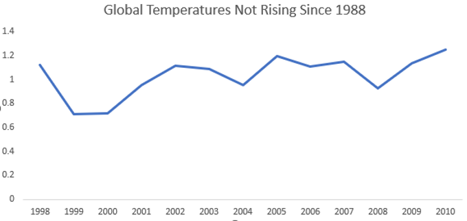
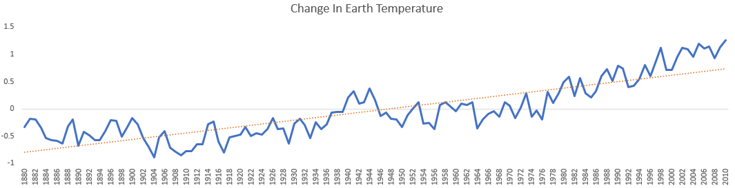
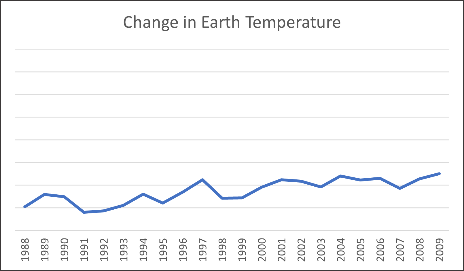
By cherry-picking certain data points or periods, one can craft misleading narratives. For example, claiming global warming has stopped by choosing 1998 as a starting point for temperature trends, as shown in the visualization below.
1998 was an exceptionally warm year due to an El Nino event. Starting with it as a baseline creates a misleading 'pause' in warming. A visual that shows temperature for a longer period of time will paint a different picture.
Or claiming global warming stopped because there was an unusually cold year in 2008. This cherry-picks a single outlier rather than looking at the long-term warming trend.
Over-Simplification
Complex data might be oversimplified for communication, losing vital details. A graph without proper axes or a misplaced baseline can give incorrect impressions. For example, showing a graph of rising temperatures without properly labelled axes to exaggerate the increase. This misrepresents the data by omitting key details.
Ignoring Uncertainties
Scientific measurements often come with uncertainties, typically mentioned as error margins. Ignoring these can lead to overstated claims. For example, stating sea levels will rise exactly 3 feet by 2100 without mentioning error bars from scientific projections. This ignores the uncertainty ranges and overstates precision.
Strengthening Your Data Literacy
To navigate the vast expanse of information and potential misinformation surrounding climate change, consider these strategies inspired by competencies from our Data Literacy Blueprint:
Diversify Your Sources (Collecting and Gathering Data)
Don't rely on a singular source. Venture into peer-reviewed journals, consult renowned climate organizations, and engage with academic institutions. A diverse pool of reliable sources ensures a rounded understanding.
Question the Narrative (Data-Enabled Questioning)
Always maintain a sense of curiosity. If a data point or claim strikes you as overly convenient or alarmist, probe deeper. Analyze the methodology, scrutinize the data sources, and comprehend the context. Moreover, recognize the innate human bias — confirmation bias. Challenge yourself to assess data objectively, regardless of whether it resonates with your personal beliefs.
Educate Yourself (Describing Data / Analyzing Data)
While an advanced degree or being a climate scientist isn't necessary, fortifying your core data literacy skills certainly aids in more astute climate information analysis. Here are some areas to bolster:
Grasp statistical concepts: mean, median, variation, correlation vs causation, and statistical significance
Familiarize yourself with standard climate data visuals: line graphs, bar charts, scatter plots
Learn to detect visual deception in charts, such as misleading axes or truncated y-axes
Delve into data analysis fundamentals: identifying cherry-picked data, understanding sample size significance, and gauging margins of error
Understand the scientific method and where there is consensus versus uncertainty
Refine your ability to evaluate sources, differentiating between credible scientific outlets and less reliable ones
Look to the Past, But Consider the Present (Reasoning with Data)
Ground your analysis in historical context, but remain attuned to the nuances of the present. Recognize that while our Earth's climate has seen natural shifts, the current trajectory possesses unique characteristics. Factors like the unprecedented rate of modern warming and the unparalleled CO2 levels, as evidenced by paleoclimate records, underscore the distinctiveness of our current climate reality. Leveraging both historical and current data empowers a more comprehensive understanding.
Data stands as a formidable ally in our battle against climate change. It grants us clarity, informs our strategy, and tracks our progress. Yet, its power hinges on adept utilization. Through our ‘Becoming a Better Data Citizen' series, we champion an informed, discerning approach to data consumption. And in the face of climate change, being data-literate could very well be among the most significant contributions you can offer to our planet.
Take Action with theData Literacy Blueprint: To further empower yourself in the digital age, we invite you to explore our Data Literacy Blueprint. This practical guide is meticulously crafted to help regular individuals like you develop crucial skills in data literacy, ethics, and informed decision-making. Navigate the digital landscape with confidence, and turn data into a tool for personal empowerment.
Kevin is an author, speaker, and thought leader on topics including data literacy, data-informed decisions, business strategy, and essential skills for today. https://www.linkedin.com/in/kevinhanegan/
While everyone chases better tools and more data, the real edge comes from better questions. Master the 5-step ladder that elevates any analysis from 'what happened' to 'what should we do next?'
We're testing data literacy all wrong. Multiple-choice quizzes measure memorization while real decisions require navigating ambiguity and uncertainty. Discover how AI coaching transforms assessment from scoring answers to developing critical thinking at scale.
Traditional tests miss the mark. Real data literacy means thinking, not memorizing. Discover how generative AI can coach critical reasoning skills at scale, building true data fluency for the next generation.
Schools speak in scores. Parents speak in patterns. When your child's test results say 'fine' but you see daily struggles, something's missing. Learn to spot what assessment data hides and become your child's strongest advocate with data-smart parenting skills.
Becoming data literate begins in your inbox. Sign up to receive expert guidance, news, and other insights on the topics of data literacy and data-informed decision-making. Want to know more about our mission? Visit our About Page. Thanks for visiting!