Schools speak in scores. Parents speak in patterns. When your child's test results say 'fine' but you see daily struggles, something's missing. Learn to spot what assessment data hides and become your child's strongest advocate with data-smart parenting skills.
Your team doesn’t have a skills gap, they have a belief gap. Data literacy isn’t about skills, it’s about rewiring how people think. Discover why belief, not training, drives change.
Most organizations aren’t data-driven—they’re data-addicted. Discover why more dashboards, metrics, and storage aren’t helping you make better decisions and how to break the cycle that’s paralyzing your team.
Becoming a Better Data Citizen. Beyond the Percentages -Assessing True Prevalence in Data
Statistics don't always tell the full story. As a data citizen, learn to evaluate data critically by looking beyond surface-level percentages to discern true prevalence and questioning standalone numbers to ensure proper context.
Statistics are often presented suggesting one group exhibits higher or lower rates of some trait compared to another group. This data may come from news headlines, reports in the workplace, research findings, or other sources. Yet without scrutinizing the underlying numbers, data citizens risk developing misguided perceptions no matter the source. Becoming a better data citizen means looking past surface-level percentages to truly understand absolute prevalence, while also questioning standalone statistics to ensure proper denominators are considered. Evaluating figures in context rather than isolation allows for the discernment of credible insights versus misleading portrayals.
Understanding Key Data Terminology
When evaluating data comparisons, it’s important to understand key terminology related to reporting formats:
Prevalence refers to how frequent or widespread something is in terms of total cases or frequency within a population. Synonyms like absolute count, total quantity, and overall magnitude also describe prevalence. This data format communicates the comprehensive size of a phenomenon.
Percentage represents a proportional rate - a part-to-whole relationship describing what portion of the population exhibits a specific trait. Percentages quantify the relative scale but exclude the sample size context.
Examples
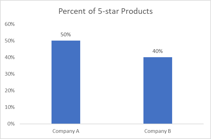
Suppose a report claims that 50% of products sold by Company A receive 5-star customer ratings, while just 40% of Company B's products get 5 stars. This makes it sound like Company A has higher quality merchandise.
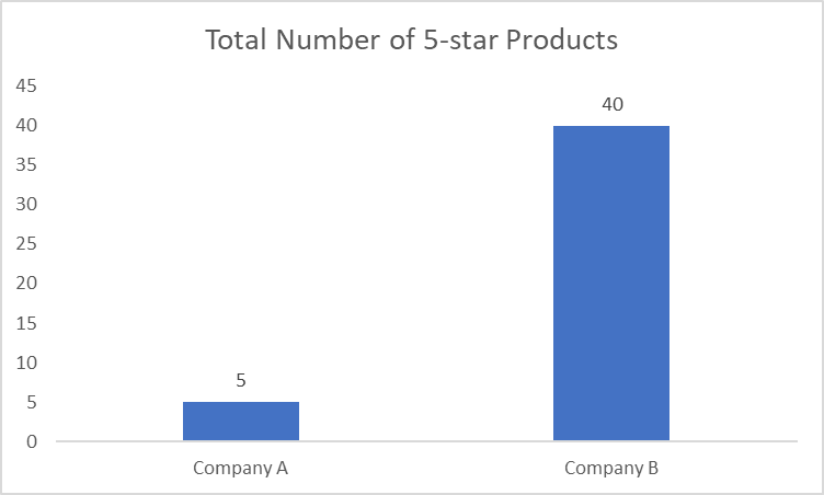
However, the underlying sample groups differ - Company A only sells 10 products whereas Company B sells 100 different products. So breaking it down:
Company A has 5 products rated 5-stars (50% of 10 products)
Company B has 40 products rated 5-stars (40% of 100 products)
While the percentage is lower, the absolute number of highly rated products at Company B is much greater at 40 items versus 5 at Company A. But looking strictly at the percentages obscured that nuance.
Read the full story
Sign up
now to read the full story and get access to all posts for
subscribers only.
Schools speak in scores. Parents speak in patterns. When your child's test results say 'fine' but you see daily struggles, something's missing. Learn to spot what assessment data hides and become your child's strongest advocate with data-smart parenting skills.
Are your metrics telling different stories? Becoming a data whisperer means learning to hear what others miss: the signals behind the noise, the insight behind the contradiction, and the full picture behind the numbers.
Carl Sagan warned of a future where misinformation and confusion persist despite an abundance of data. Is it happening now? From AI-driven decision-making to growing disparities in data access. Data literacy is essential for navigating this landscape and ensuring informed, equitable decision-making.
Facts don’t always tell the full story. Data can be factually accurate yet still present a biased narrative. In business and life, even technically correct data can lead us astray when taken out of context or selectively framed. Learn how to spot the blind spots and see the whole picture.
Becoming data literate begins in your inbox. Sign up to receive expert guidance, news, and other insights on the topics of data literacy and data-informed decision-making. Want to know more about our mission? Visit our About Page. Thanks for visiting!