Most digital transformations fail not because of technology, but because leaders neglect the human operating system: beliefs, behaviors, and culture. True transformation is human-first, with tech as the enabler.
Companies keep buying skills and still stumble. The problem is not competence. It is missing humility, ethics, and adaptive mindsets. Learn the three-legged model for readiness and how to avoid dangerous competence
From Data Dump to Decision Driver - Transforming Dashboards to Drive Action
Your BI tool can generate a thousand charts, but can it tell you the one thing you need to do Monday morning? Here's how to turn dashboard junk food into nutritious insights that actually feed decision-making
The future of business intelligence isn't about giving everyone access to everything. It's about giving the right people access to the right insights at the right moment to make the right decision.
Most dashboards are the junk food of business intelligence.
They look satisfying at first glance: colorful charts, impressive metrics, the comforting glow of "being data-driven." But like a bag of chips, they give you a temporary sense of being informed while leaving you just as hungry for real insights as when you started.
Worse, they're addictive. The more dashboards your organization consumes, the more you crave. Teams keep building new ones, adding more charts, more metrics, more visual complexity until you're bloated with beautiful reports that nobody actually uses to make decisions.
Here's the uncomfortable truth: most dashboards are hurting us more than helping us. They create the illusion of understanding while burying the insights that actually matter. They make us feel productive while keeping us perpetually confused about what to do next.
Recently, I redesigned a real dashboard for a client success team. What began as a well-intentioned but nutritionally empty reporting tool became a focused, actionable dashboard that leadership could actually digest and act upon. In this article, I'll walk you through the transformation and show you how to turn your junk food dashboards into something that actually nourishes decision-making.
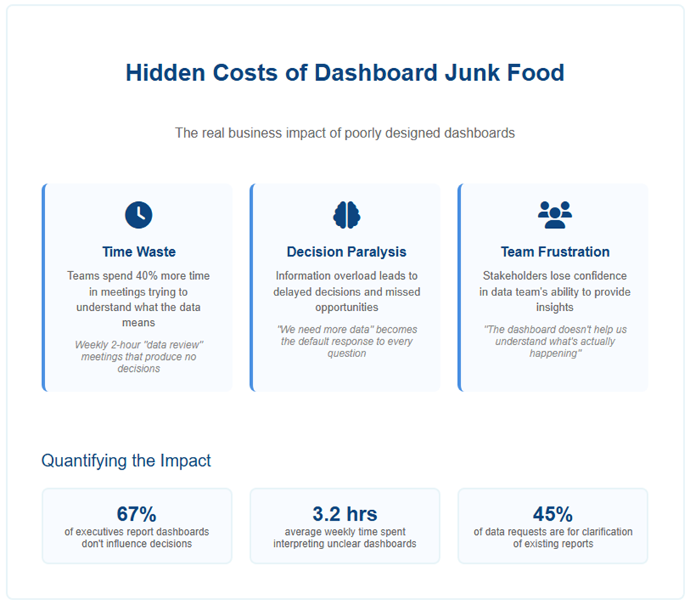
The Problem - Why Dashboard Junk Food Is Everywhere
Here's the original dashboard:
At first glance, it looks substantial with charts, metrics, even color-coding. But like junk food, it's all empty calories:
We've confused data visualization with insight visualization. Pretty charts don't equal clear thinking.
No nutritional value. What's the purpose of this dashboard? What question does it answer? What decision does it enable?
Data without insight. Raw metrics are presented like ingredients on a nutrition label. They are technically informative but useless for actually nourishing your understanding.
Focus on quantity over quality. Activities and statuses are listed without connecting to what actually feeds business success.
No "so what" factor. What's working? What needs attention? What should you do after consuming this information?
This isn't just poor data presentation. It's a dashboard that fills you up without feeding you and leaves you more confused and less capable of taking action than when you started.
Why Data Presentation Isn’t Enough
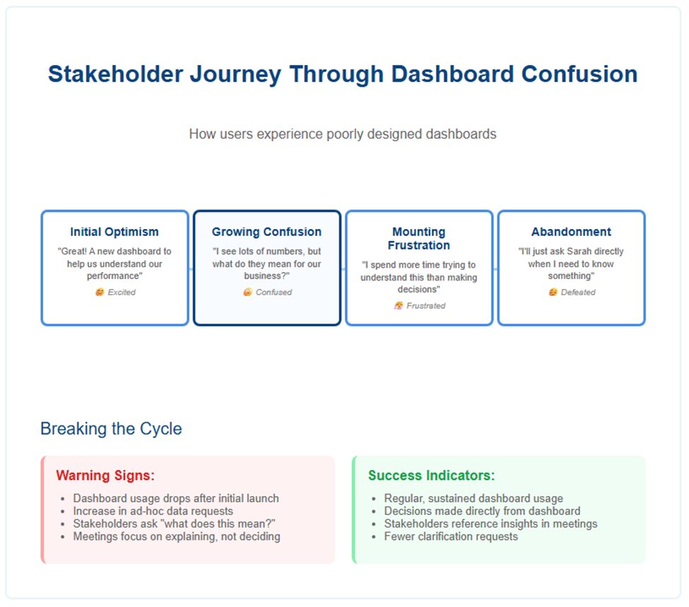
Think of the difference between a vending machine and a carefully prepared meal. A vending machine offers convenient access to lots of options, but none of them provide real sustenance. Most dashboards are organizational vending machines, they give you quick access to data, but they don't nourish understanding or enable action.
Good dashboards, like good meals, are intentionally crafted to serve a specific purpose. They don't just display data they:
Answer a specific business question
Frame information in the right context
Highlight what matters most
Guide decisions and next actions
Your BI tool can generate a thousand charts. But can it tell you the one thing you need to do on Monday morning? That's the only dashboard feature that matters.
Whether you're building for ongoing monitoring or strategic storytelling, the goal remains the same: help your audience understand what's happening and know what to do about it.
The Redesign - From Data to Insights
Here's the redesigned version:
What changed? Everything. Instead of a data buffet, we created a focused meal plan.
1. Start with Context and Insight
Instead of a generic title, the dashboard opens with a clear summary:
In the first five seconds, leadership knows what's happening, why it matters, and what they should focus on. No hunting through charts to figure out the story.
2. Focus on Outcome-Relevant Metrics
Rather than tracking every possible activity, the dashboard focuses on what actually drives business success:
Client retention (the key outcome)
Client satisfaction
AUM growth
Client engagement trends
Each metric ties directly to business goals, no empty calories here.
3. Visuals That Guide, Not Just Display
A clear trend chart shows exactly when retention gains plateaued
Engagement trends are color-coded to highlight the decline
Metrics are framed with headlines and interpretation, not left for the viewer to decipher
The visuals don't just show data; they tell the story of what's happening and why it matters.
4. Highlight Actions and Recommendations
A dedicated "Immediate Actions" section outlines specific next steps
Recommendations are concrete and actionable (target 400+ clients, resume webinars, adjust advisor allocation)
This transforms the dashboard from a status report into a decision tool that actually guides action.
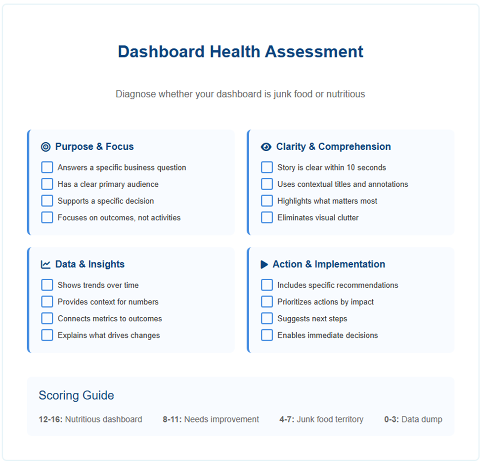
Best Practices - How to Create Nutritious Dashboards
Based on this transformation, here are principles that will help you avoid junk food dashboards:
Reduce Cognitive Load Stop overwhelming people with information. Only show what's relevant, eliminate visual clutter, and prioritize simplicity. Your audience's attention is precious so don't waste it on decorative charts.
Enhance Clarity and Comprehension Focus on insights, not raw data. Use effective titles and annotations that explain what you're seeing. Highlight what matters visually so people don't have to hunt for the important stuff.
Drive Interpretation and Action Show trends over time, not just snapshots. Connect your data to recommended actions. Prioritize metrics that tie to outcomes, not just activities. Always answer: "What should we do next?"
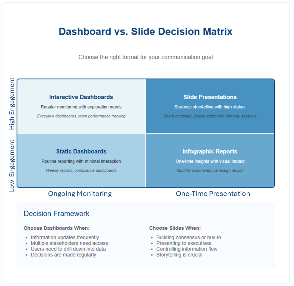
When to Use Dashboards vs. Slides
If your goal is real-time monitoring or ongoing reporting, well-designed dashboards work best. They provide consistent access to the information people need to make day-to-day decisions.
But if your goal is strategic storytelling, executive buy-in, or stakeholder alignment, consider presenting your insights as a slide-based narrative instead. Slides let you control pacing, build arguments progressively, and emphasize the human impact of your data.
The dashboard I redesigned works great for ongoing monitoring. But when I needed to present the client success strategy to leadership, I used a slide deck to tell the story more persuasively.
Before-and-After: The Takeaway
Side by side, the difference is clear:
Old Dashboard
New Dashboard
Data-focused
Insight-focused
No context or purpose
Clear framing and narrative
Equal visual weight
Emphasis on outcomes
No guidance
Actionable recommendations
Final Thought - Good Dashboards Nourish Decision-Making
Dashboards aren't about showing data. They're about showing people what matters, why it matters, and what to do next.
Whether you're reporting operational metrics or crafting a persuasive story, remember that your audience is hungry for understanding, not information. Feed them insights, not empty calories.
Stop building vending machines. Start preparing meals.
That's how you transform a dashboard from a data dump to a decision driver.
Company Success Metrics Dashboard - 1H 2025
Company Success Metrics Dashboard
First Half 2025 Performance Overview
Client Retention Rate
91%
Increased from 82% to 91% over the past fiscal year
Assets Under Management
£3.5B
Grew by 15%, reaching £3.5 billion
Portfolio Performance
+6%
Clients with diversified portfolios saw an average return increase of 6%
Client Satisfaction
92%
92% of surveyed clients reported increased confidence in their long-term financial plans
Monthly Client Engagement Activities
Asset Growth Trajectory
Advisor Time Allocation
Client Retention by Quarter
Additional Performance Indicators
Educational Webinars Hosted25
Total Webinar Attendees3,000+
Advisor Productivity Increase30%
Time on Strategic Activities↑ 30%
Administrative Task ReductionSignificant
Improved Company Dashboard - 1H 2025
Client Success Dashboard - Q2 2025
Client retention stalled in Q2 after steady growth. Engagement decline likely contributing. Recommend targeted re-engagement strategy.
Client Retention Rate
91%
FLAT in Q2
Client Satisfaction
92%
↑ 8% YoY
AUM Growth
+15%
STRONG
Client Engagement
68%
↓ 12% in Q2
Retention Trend - Q2 Plateau
Key Insight: Retention growth stalled in Q2 after 6 months of steady improvement. Coincides with reduced engagement activities.
Client Engagement Decline
Key Insight: Engagement activities dropped 25% in Q2. This correlates with retention plateau - immediate action needed.
Immediate Actions Required - Q3 Focus
Launch Re-Engagement Campaign
Target 400+ clients with reduced activity. Personal outreach from advisors within 2 weeks. Goal: 80% contact rate.
Restore Educational Programs
Resume monthly webinar schedule. Focus on Q2 dropoff clients. Target: 15 sessions, 1,500 attendees in Q3.
Advisor Time Reallocation
Shift 30% more advisor time to client strategy vs. admin. Implement new scheduling system by August 1st.
Monitor Early Warning Signals
Weekly engagement tracking dashboard. Alert system for clients with 30+ days no contact. Prevent future plateaus.
Our Client-First Strategy: Mid-Year Results
1 / 8
Our Client-First Strategy
Mid-Year Results and Insights
Six months after pivoting from transactions to relationships,
we're seeing the strongest client engagement in company history.
The Transformation
From selling products to building partnerships.
From quarterly metrics to lifetime value.
From transactions to trust.
2 / 8
Q2 2025: Record-Breaking Results
Our relationship-first approach has delivered the strongest client relationships in our 15-year history.
The Bottom Line
Clients are staying longer, investing more, and achieving better outcomes than ever before.
91%
Client Retention
Highest in company history
£500M
AUM Growth
60% from existing clients
6.2%
Average Returns
1.4% above market
3 / 8
Client Retention: Breaking Company Records
91%
↑ 9 points from last year
Industry average: 79%
91%
Us
79%
Industry
95%
2025 Target
This represents real families staying with us through major life decisions.
Our relationship-first advisory approach has created deeper trust. Clients now see us as partners, not just service providers.
The human impact: This translates to approximately 450 families who might have left but chose to stay and grow with us instead.
4 / 8
Assets Under Management: Growth Through Trust
Key Insight: Our AUM growth of £500M came 60% from existing clients increasing investments, not just new acquisitions.
Why This Matters
Existing clients investing more shows deep trust in our guidance. It's more profitable and sustainable than constantly acquiring new clients.
5 / 8
Portfolio Performance: Delivering Real Value
6.2%
Average return increase
Market average: 4.8%
Our personalized diversification strategy is delivering real results.
Real impact: For a typical £500K portfolio, this means an extra £7,000 in returns this year.
More importantly, 92% of clients report feeling more confident about their financial future.
6 / 8
Education Strategy: The Game Changer
Our 25 educational webinars reached 3,000+ clients, and attendees are 40% more likely to increase their investments.
The Strategy That Worked
Instead of selling, we focused on educating. Clients who understand their options make better decisions and trust us more.
7 / 8
What We're Doing Next
Double Down on Education
Launch monthly "Coffee & Finance" sessions for smaller groups. Target: 50 intimate sessions reaching 1,000 clients by year-end.
Expand Advisor Capacity
Hire 3 more senior advisors by September. Our current team is at capacity, we're turning away potential clients.
Technology Investment
Implement client portal by Q4. Let clients track progress 24/7 and reduce administrative burden on advisors.
8 / 8
Our Journey: From Transaction to Relationship
January 2025
Launched relationship-first strategy. Initial resistance from some advisors.
March 2025
First educational webinar series launched. 85% client satisfaction rate.
Kevin is an author, speaker, and thought leader on topics including data literacy, data-informed decisions, business strategy, and essential skills for today. https://www.linkedin.com/in/kevinhanegan/
Companies keep buying skills and still stumble. The problem is not competence. It is missing humility, ethics, and adaptive mindsets. Learn the three-legged model for readiness and how to avoid dangerous competence
Two leaders read the same AI analysis. One pivots and wins. One doubles down and loses. The gap is not skills. It is traits and mindsets like humility, resilience, courage, and long-term thinking.
Stop buying courses. Build readiness. This guide shows how to assess where you stand, develop traits and mindsets with skills, embed them in systems, and prove ROI leaders and CFOs respect.
Becoming data literate begins in your inbox. Sign up to receive expert guidance, news, and other insights on the topics of data literacy and data-informed decision-making. Want to know more about our mission? Visit our About Page. Thanks for visiting!